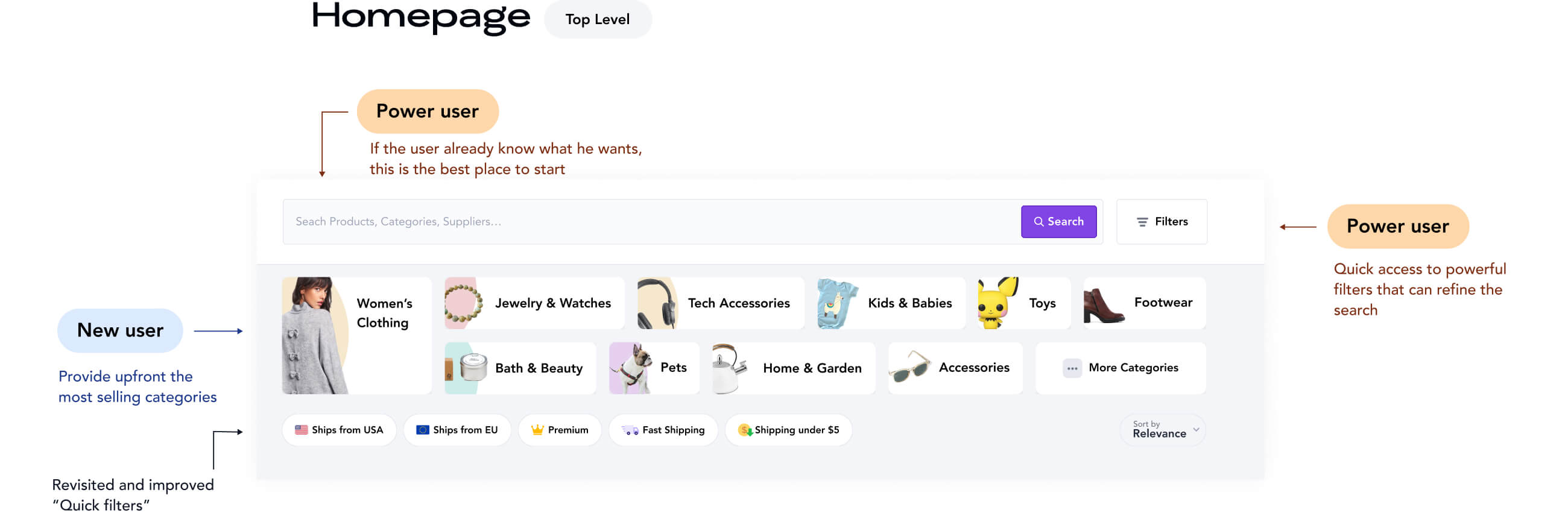
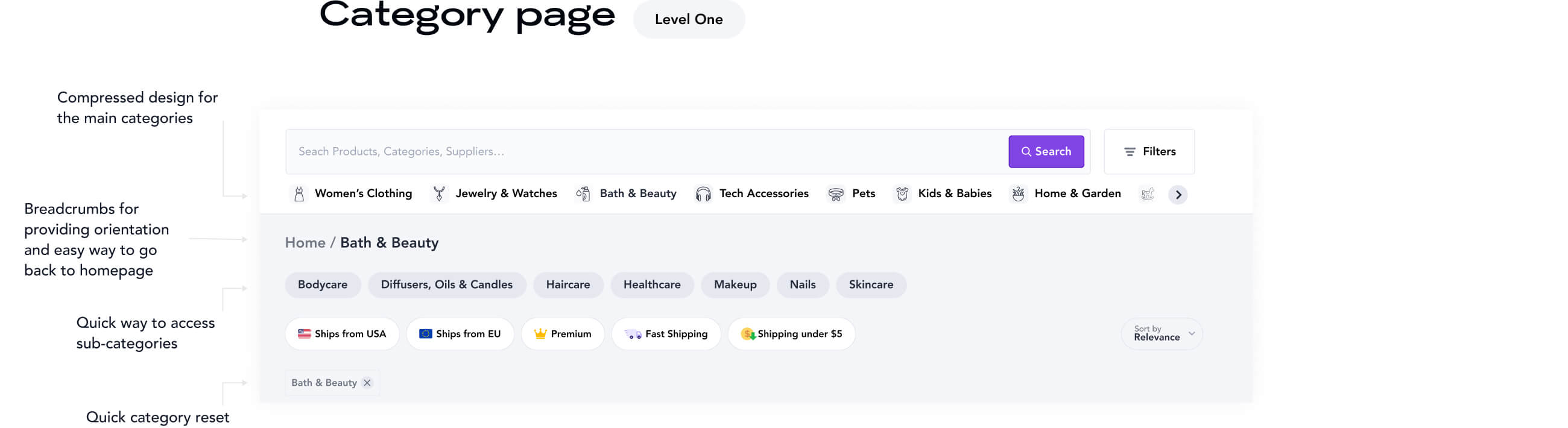
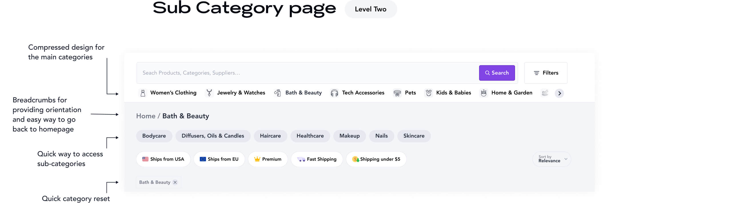
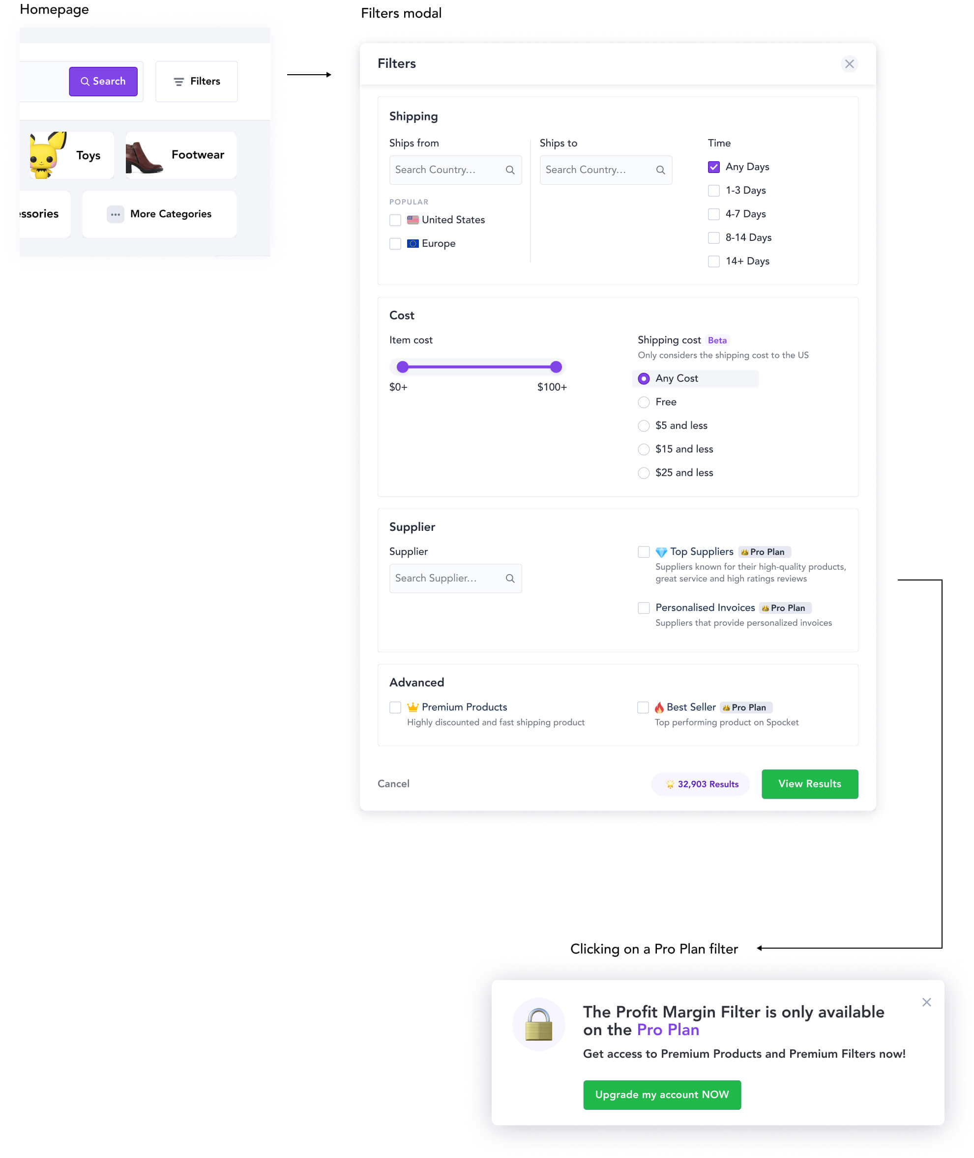
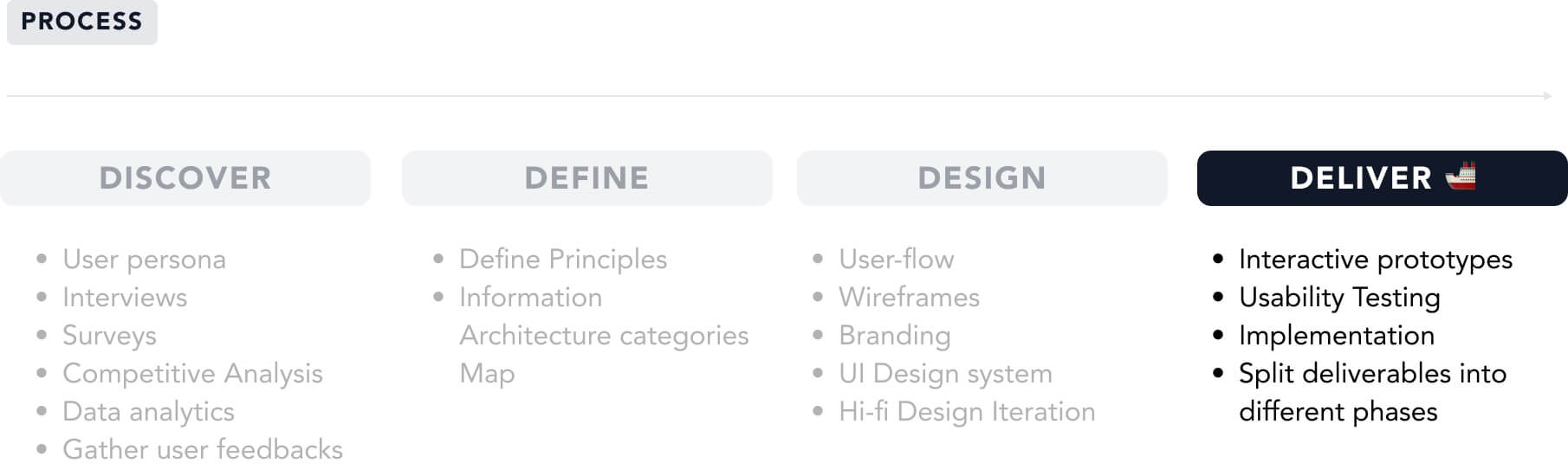
Senior Product UX/UI Designer
Star separator
Senior Product UX/UI Designer
Star separator
Senior Product UX/UI Designer
Star separator
Senior Product UX/UI Designer
Star separator
Senior Product UX/UI Designer
Star separator
Senior Product UX/UI Designer
Star separator
Senior Product UX/UI Designer
Star separator
Senior Product UX/UI Designer
Star separator
Senior Product UX/UI Designer
Star separator
Senior Product UX/UI Designer
Star separator
Senior Product UX/UI Designer
Star separator
Senior Product UX/UI Designer
Star separator
Senior Product UX/UI Designer
Star separator
Senior Product UX/UI Designer
Star separator
Senior Product UX/UI Designer
Star separator
Senior Product UX/UI Designer
Star separator
Back arrow
NEW

Spocket

Categories and filters improvements

2020
Product
UI
UX
Wireframes
Strategy
Spocket Logo

A dropshipping app marketplace with exclusive US and EU products serving 100,000+ merchants

Spocket App
OVERVIEW
YEAR
  • 2020
TEAM
  • 1 Product/Project Manager
  • 1 Product Designer Lead (Myself)
ROLE
  • Ideation, Strategy, Information Architecture, Wireframes, UX/UI Design, Design System
TIMELINE
  • 3 Months
Outcomes
+41%
Top categories usage
-7%
Bounce rate
-16%
Over filtering and zero search result

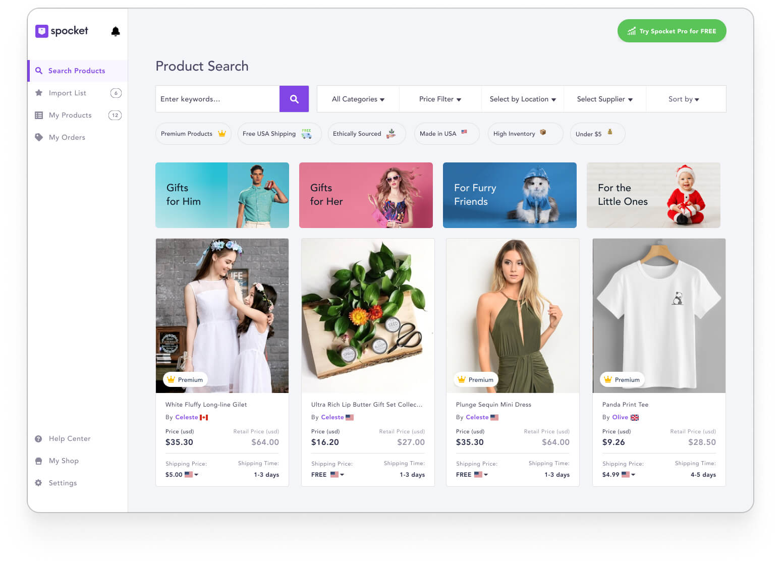
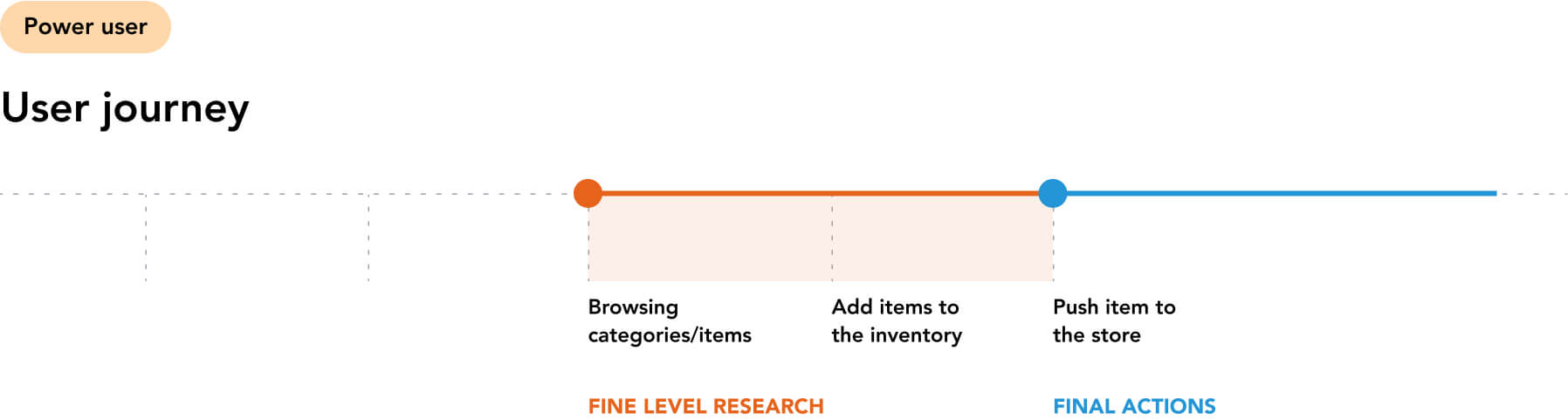
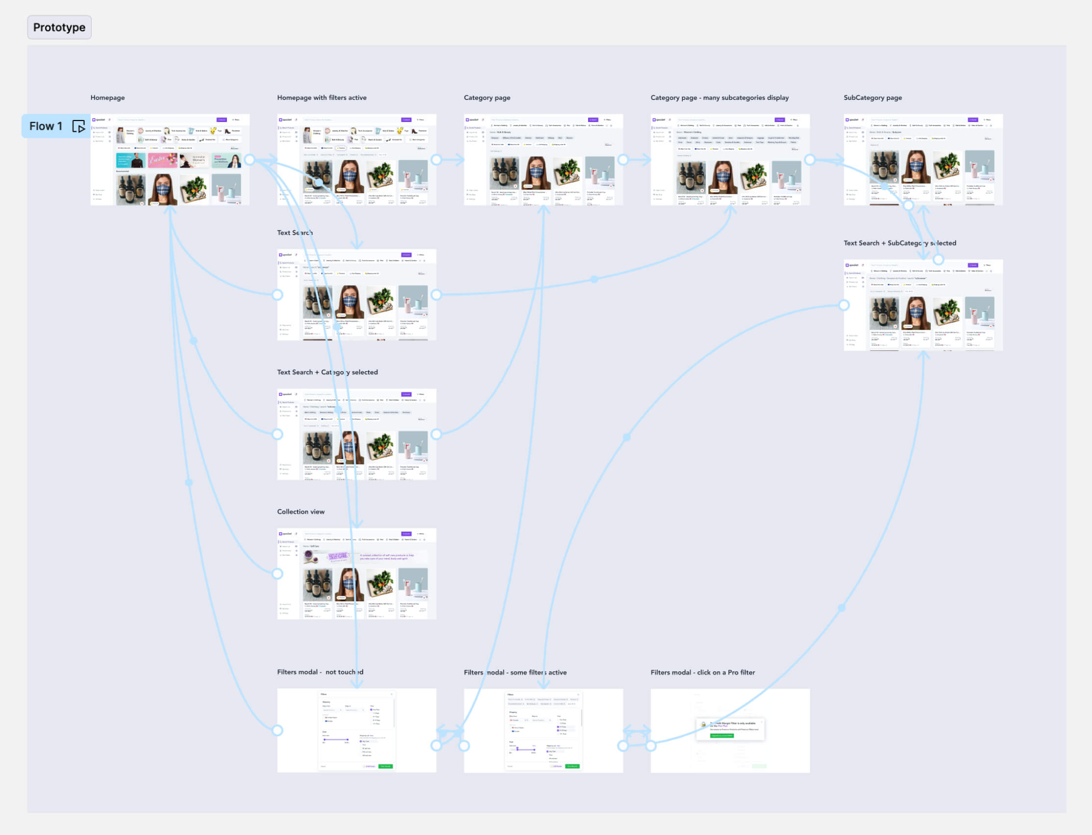
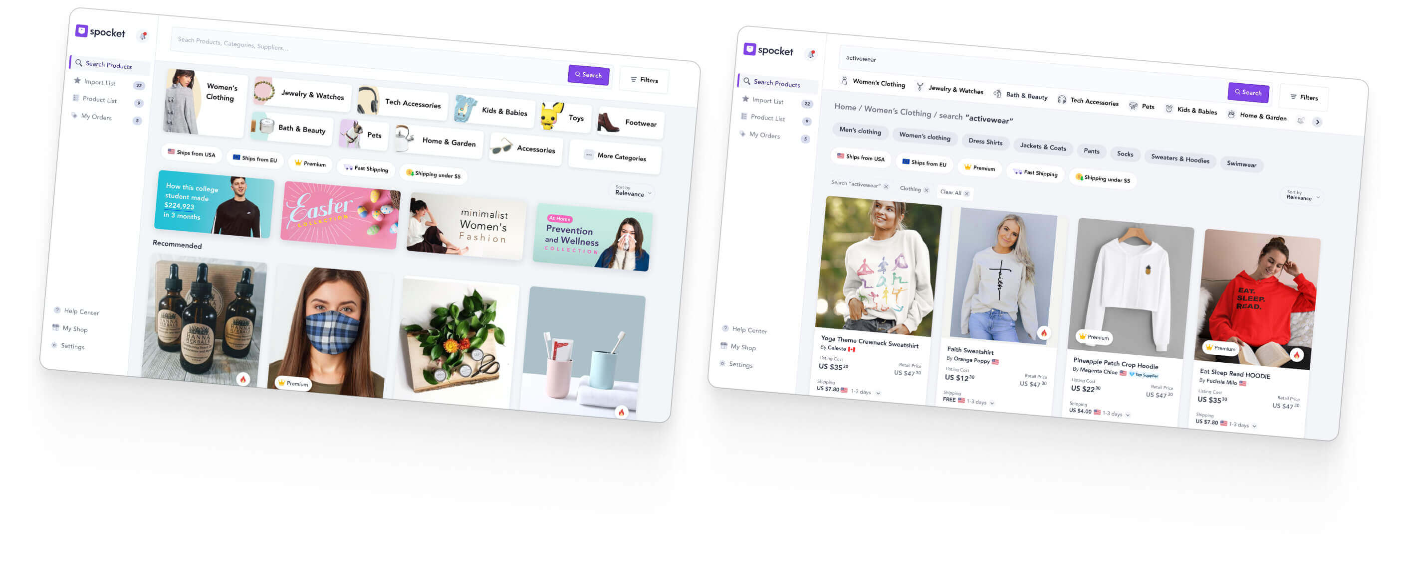
How can we improve the app navigation and filtering for the user?

The user experience plays a pivotal role in the success of any eCommerce platform. It's a make-or-break factor that can turn potential customers into loyal patrons or drive them away.

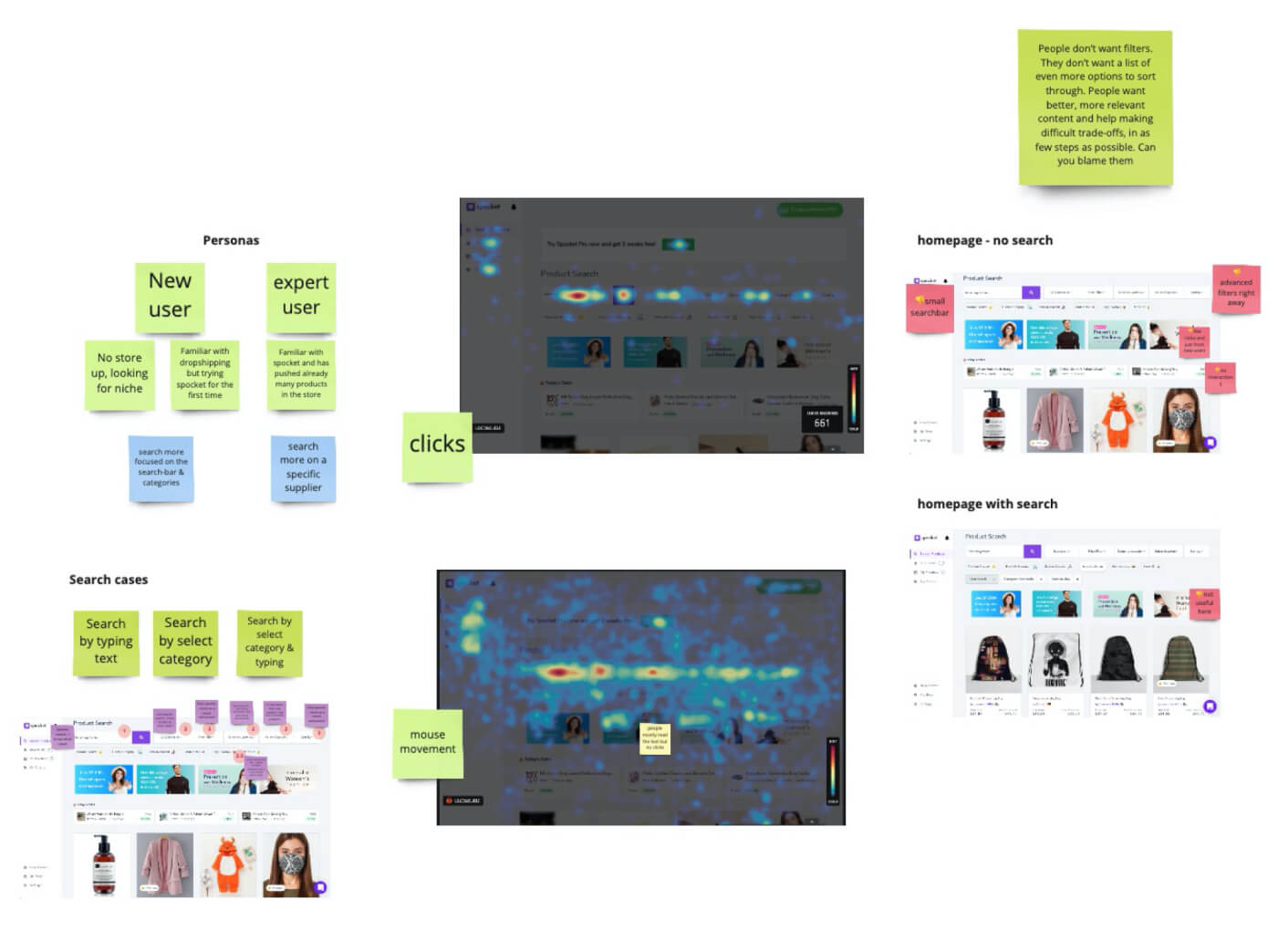
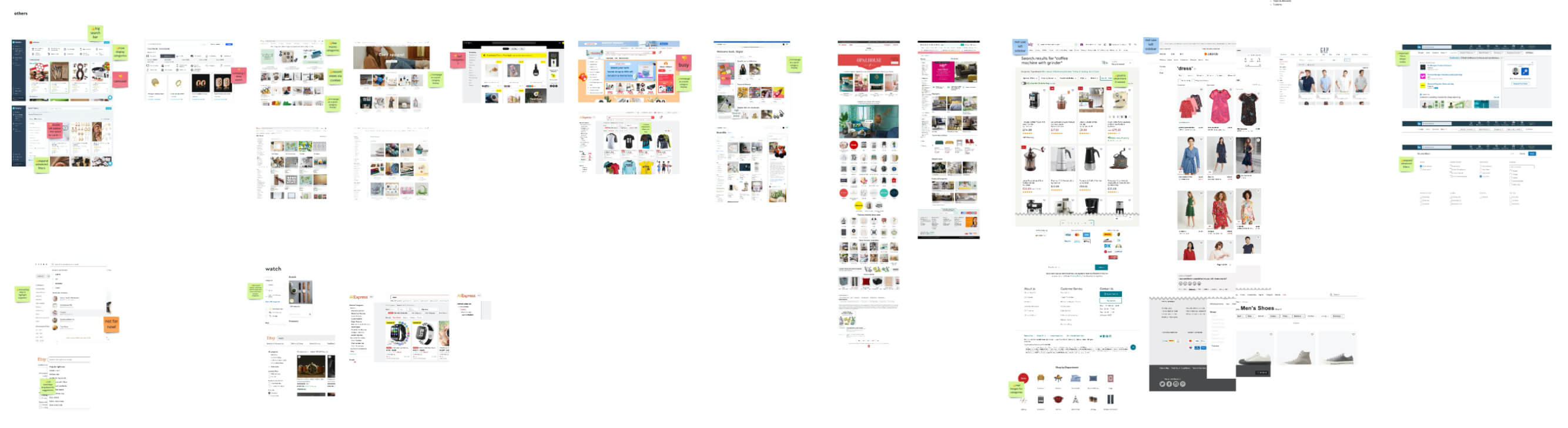
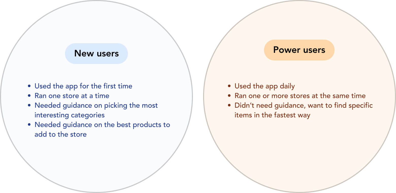
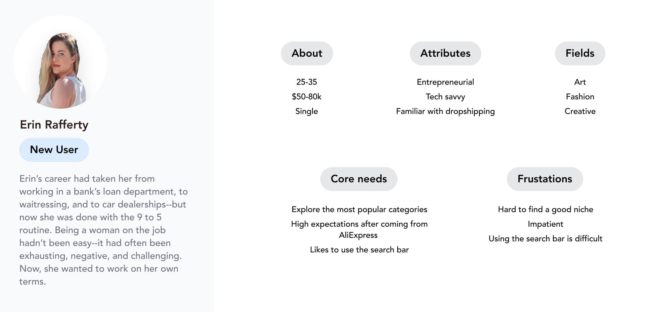
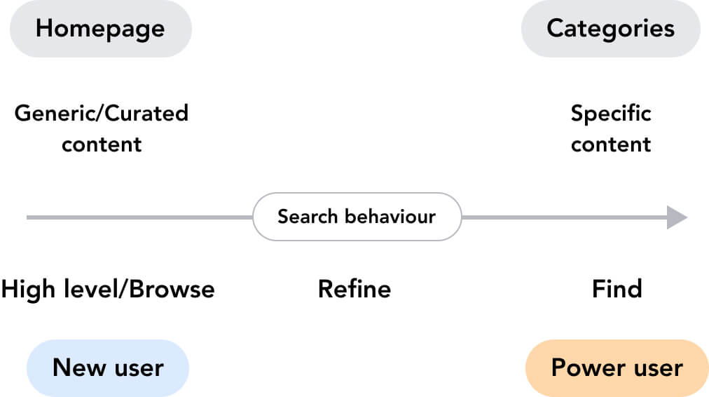
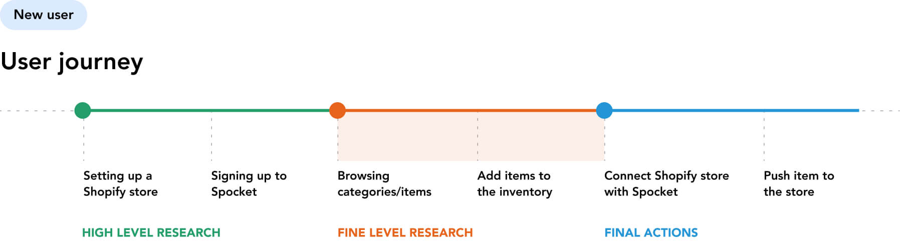
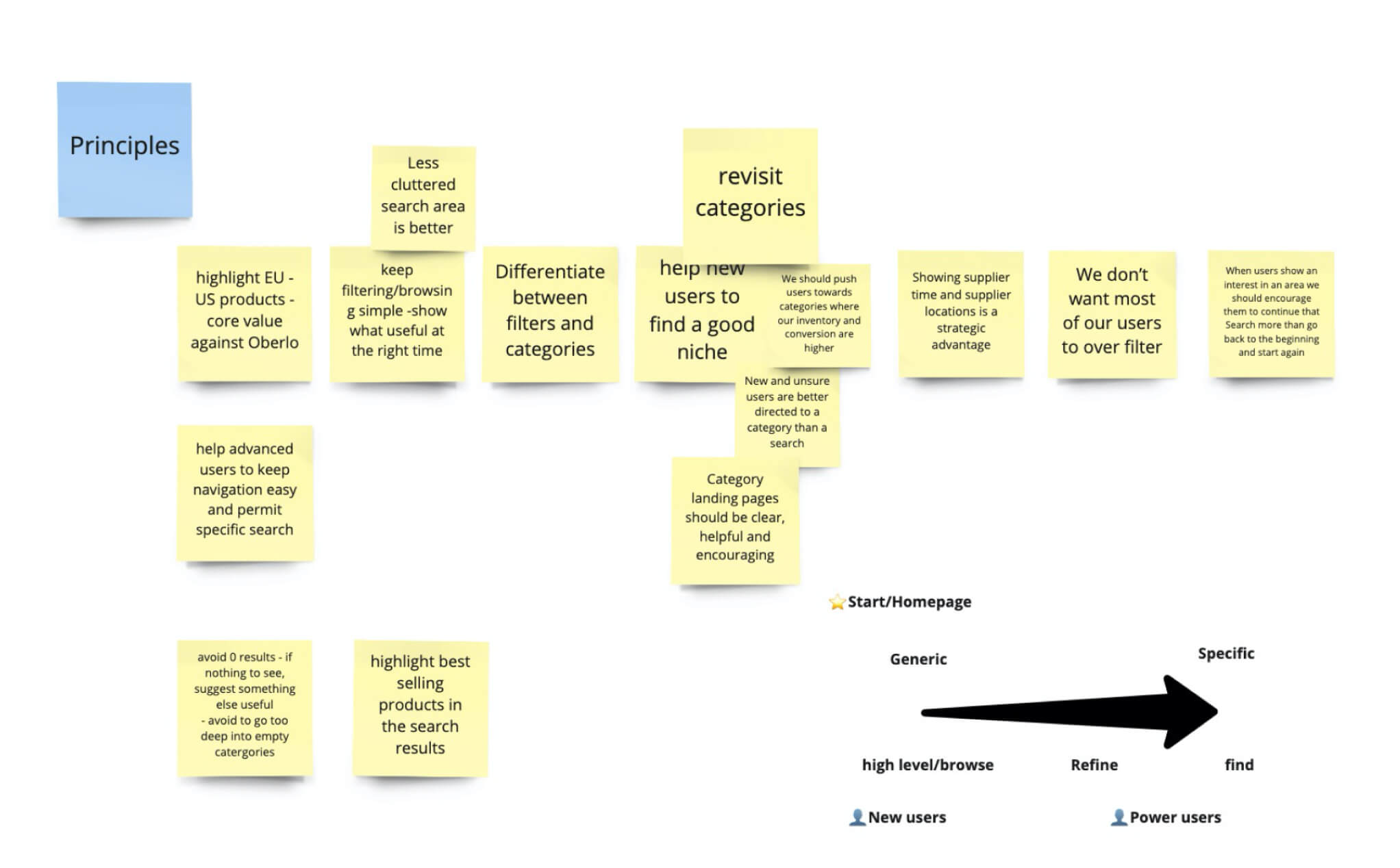
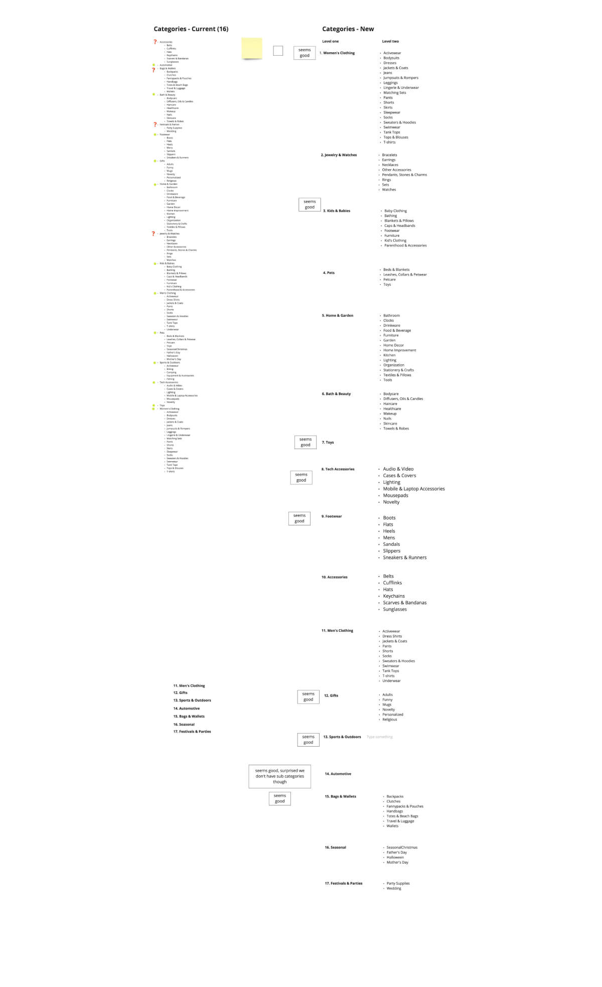
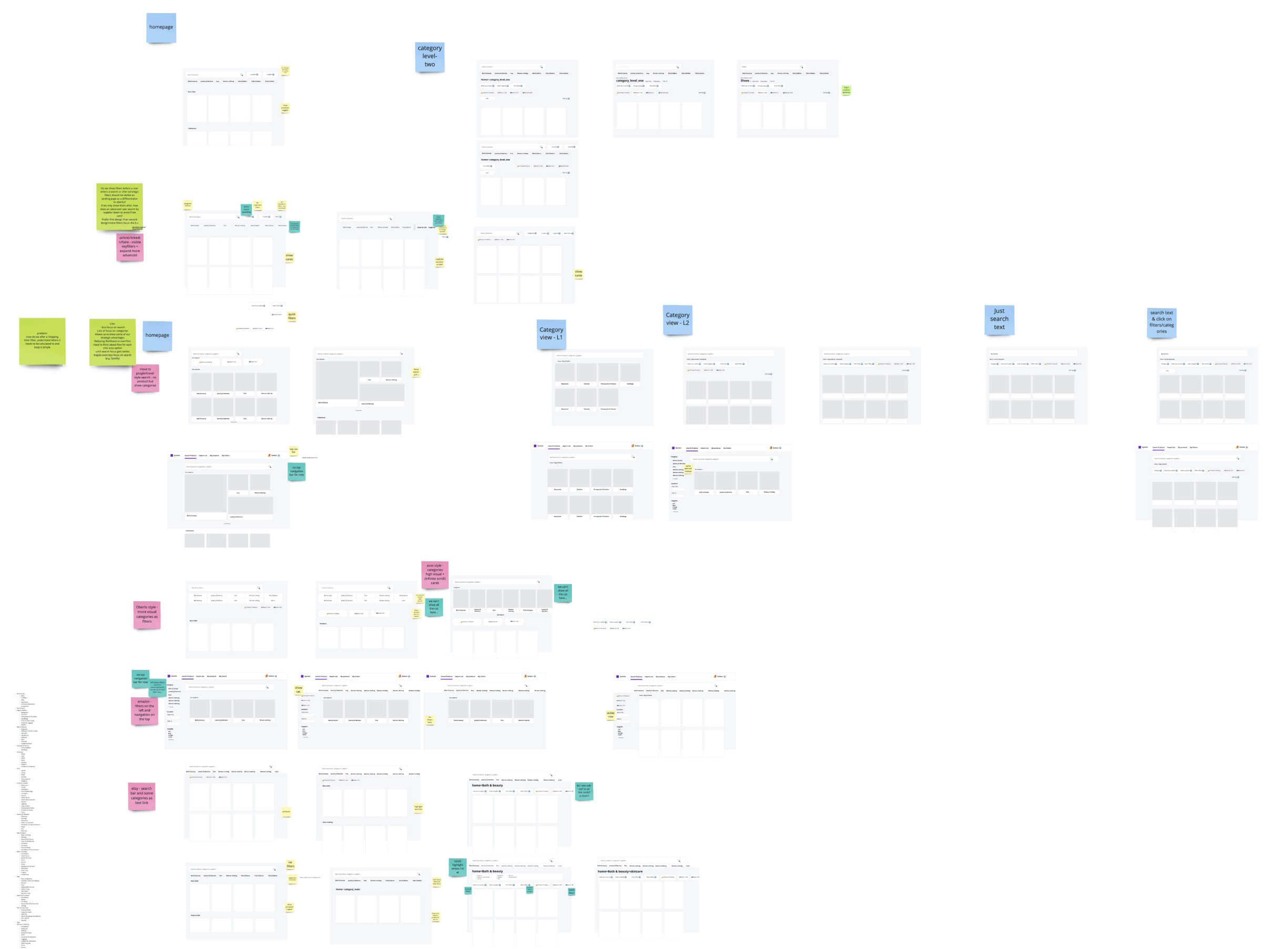
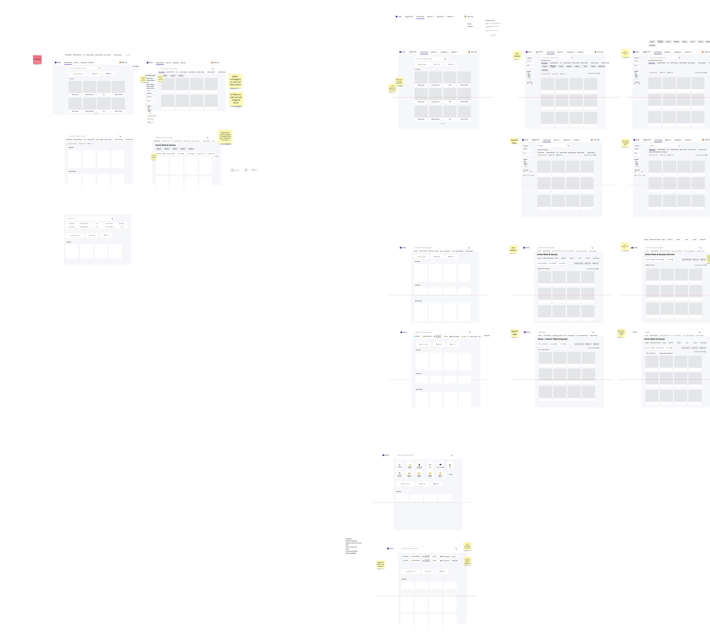
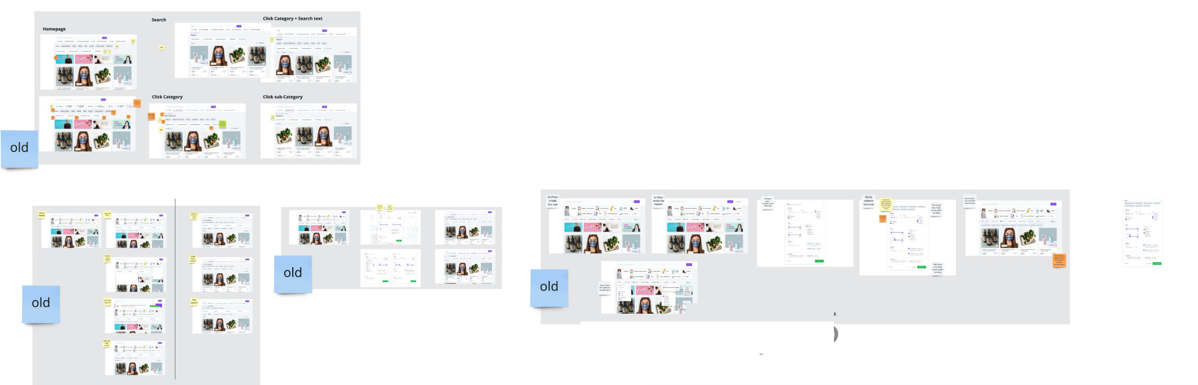
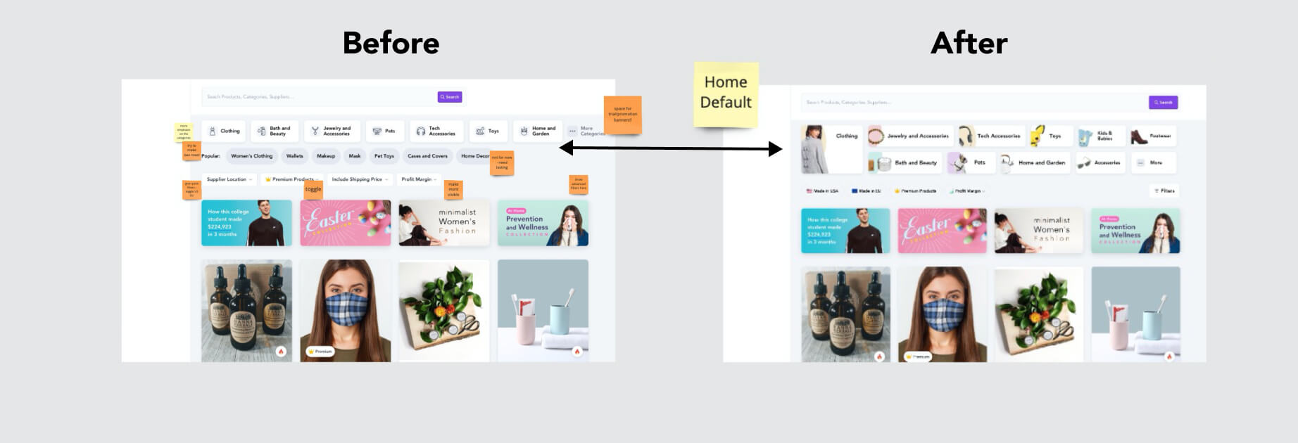
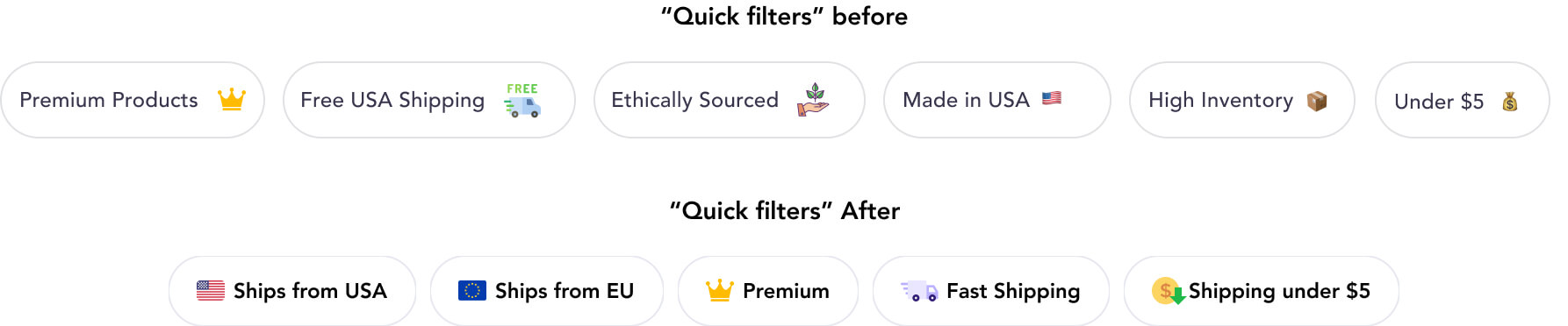
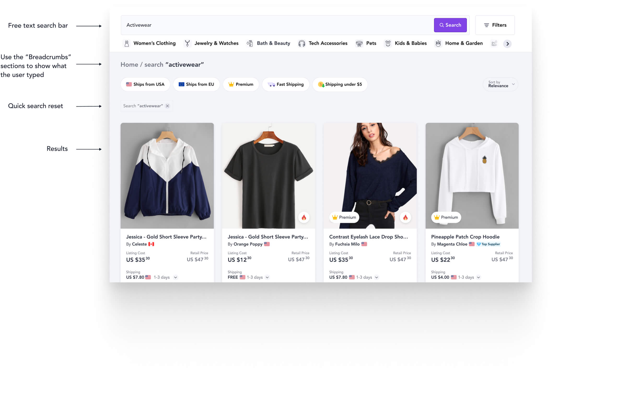
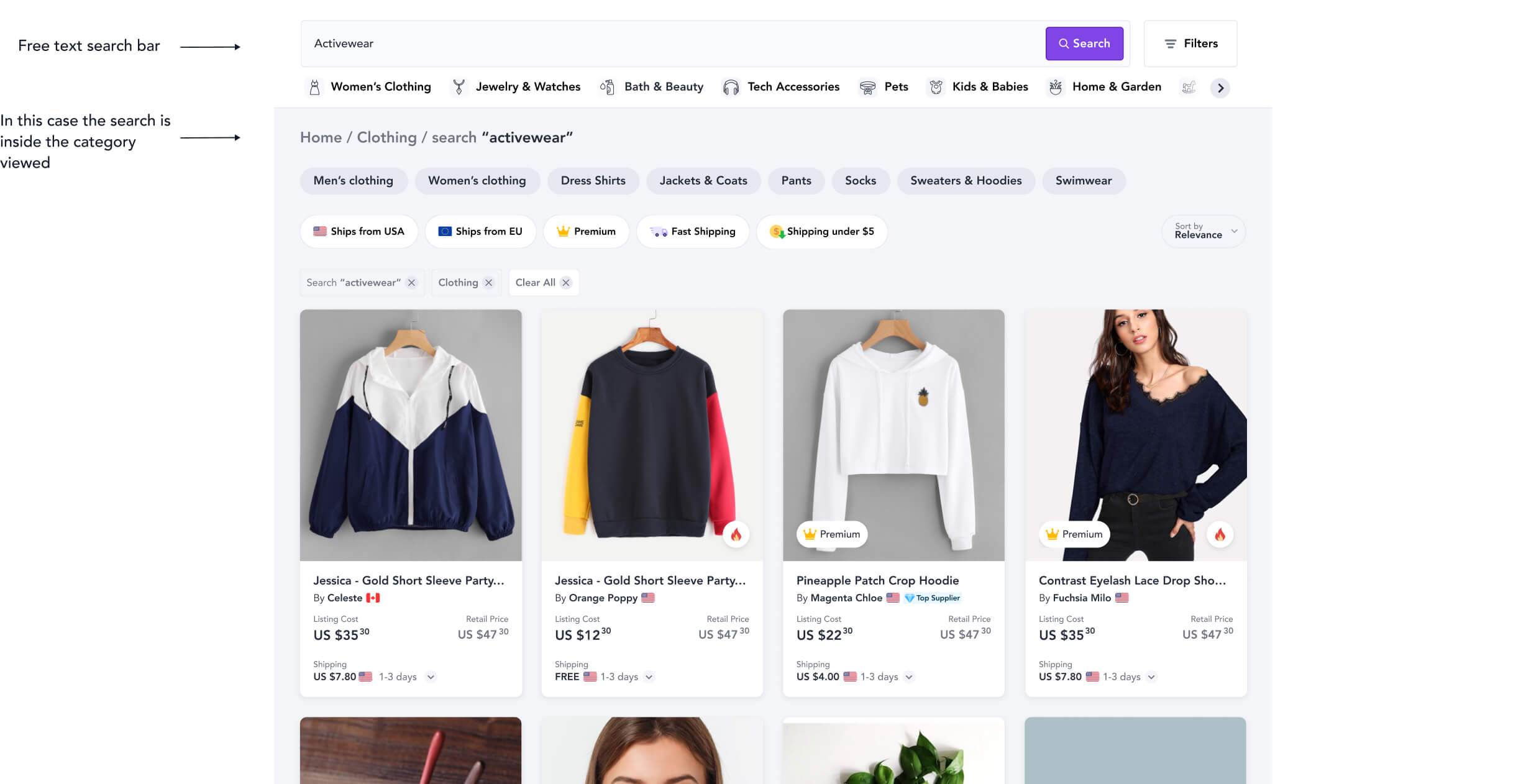
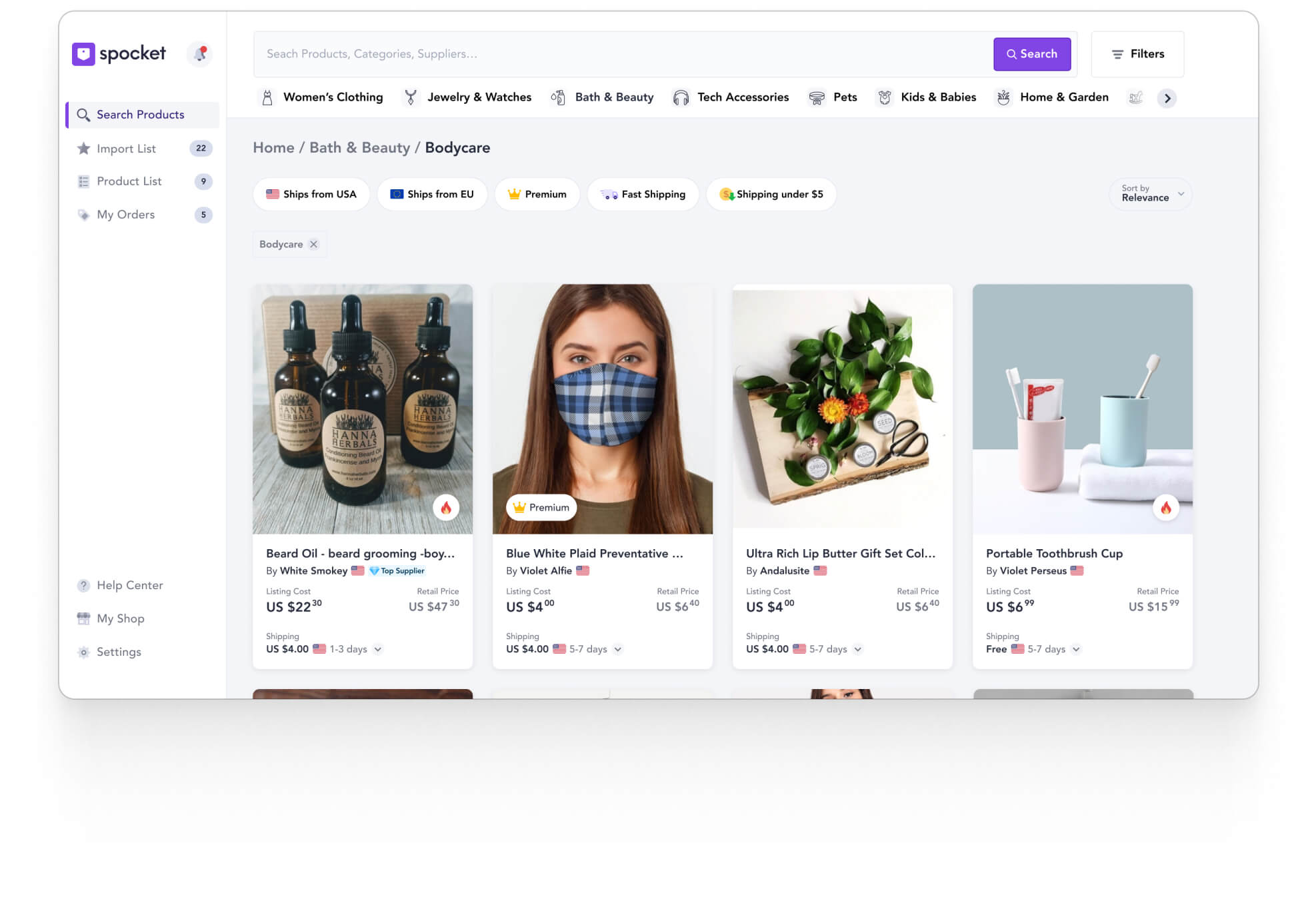
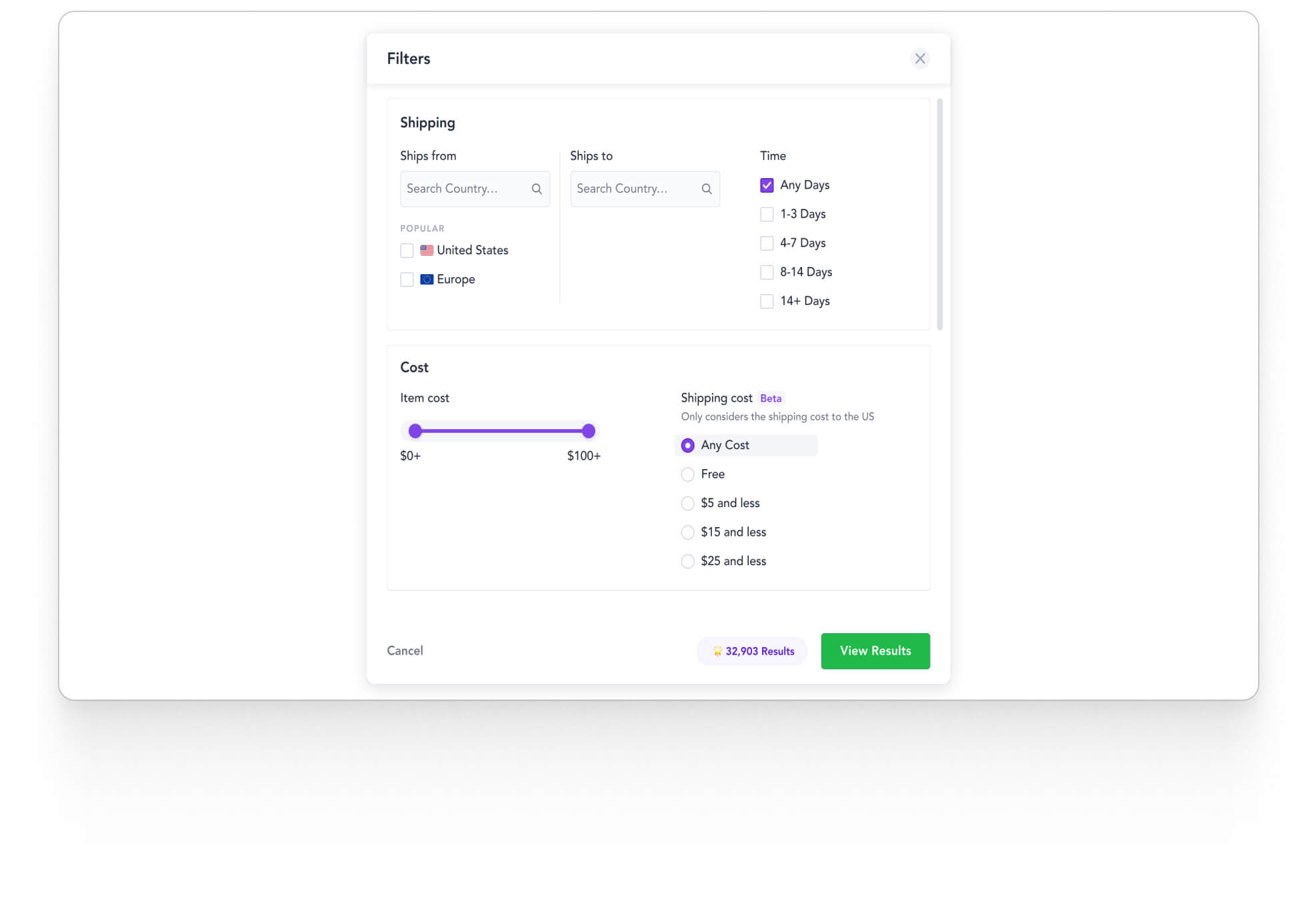
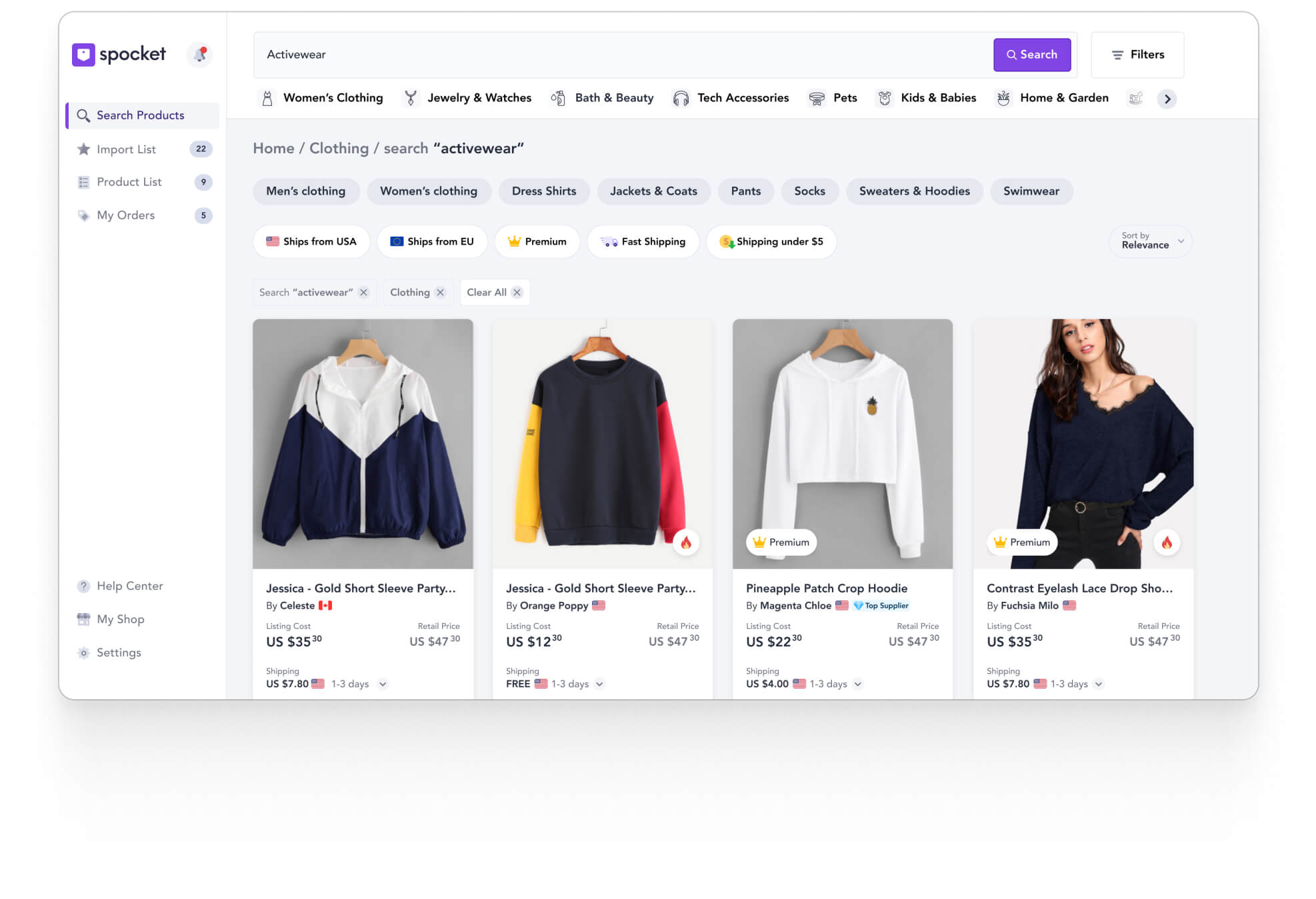
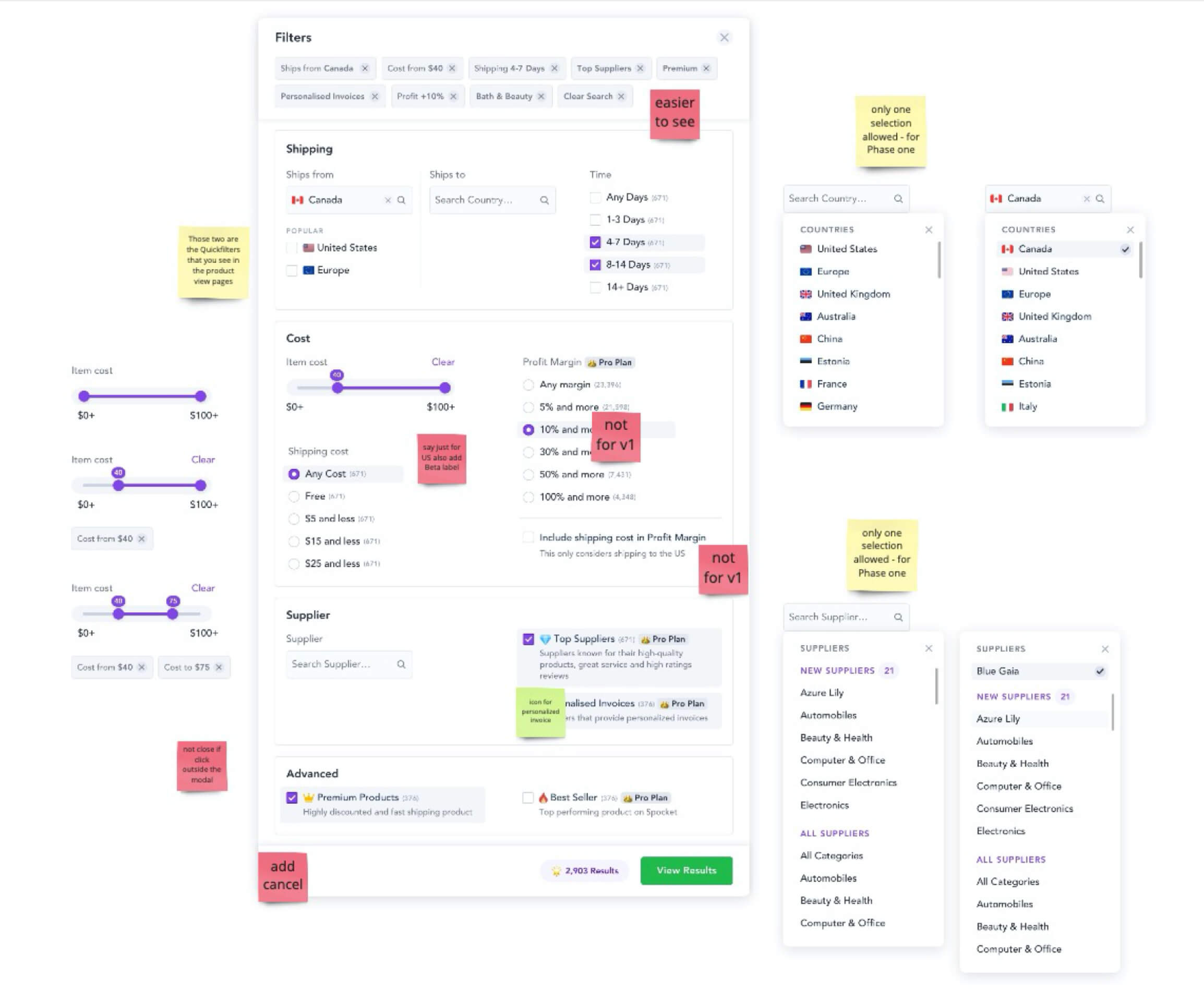
The challenges are poor UX browsing experience, particularly focusing on navigation difficulty and basic filtering options.

The implications of a frustrating UX that lead to users dropping off, is because they can't find the specific products they're looking for.

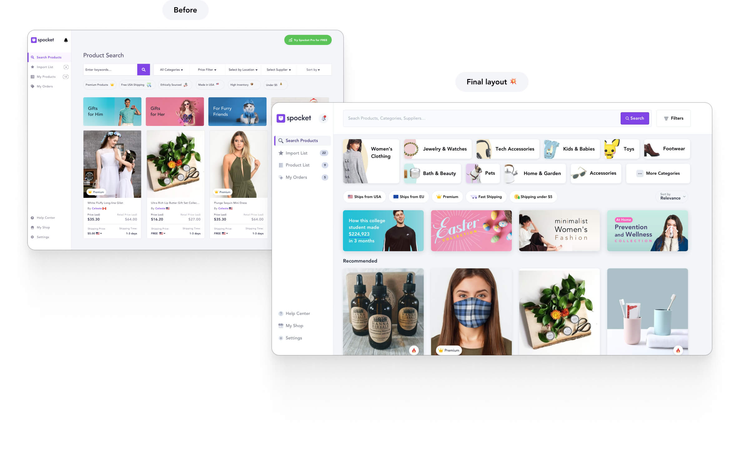
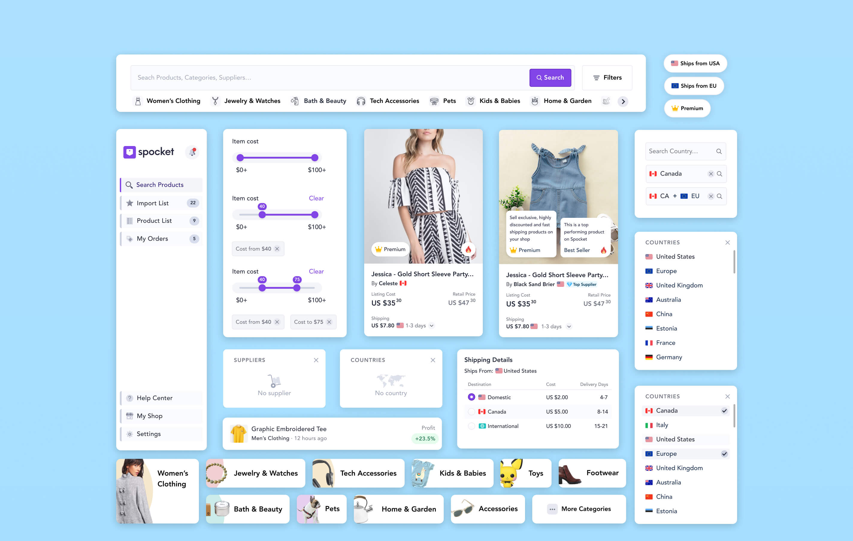
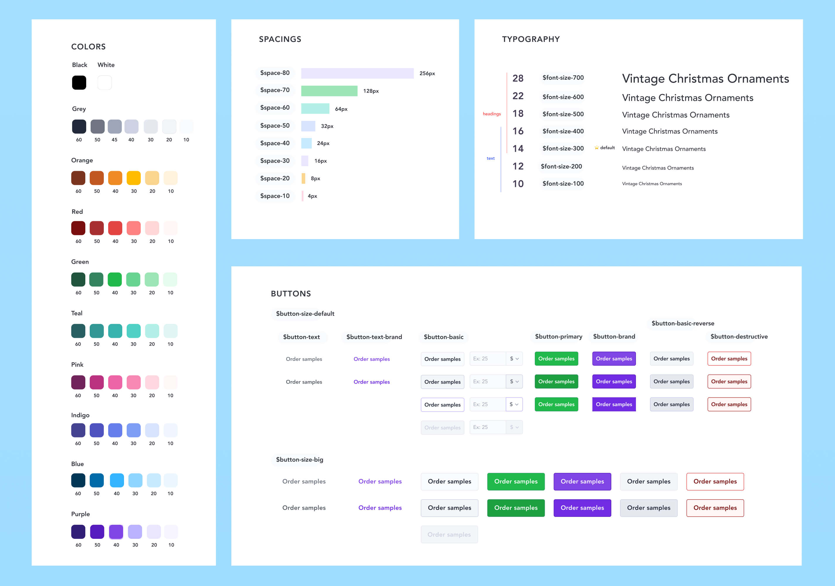
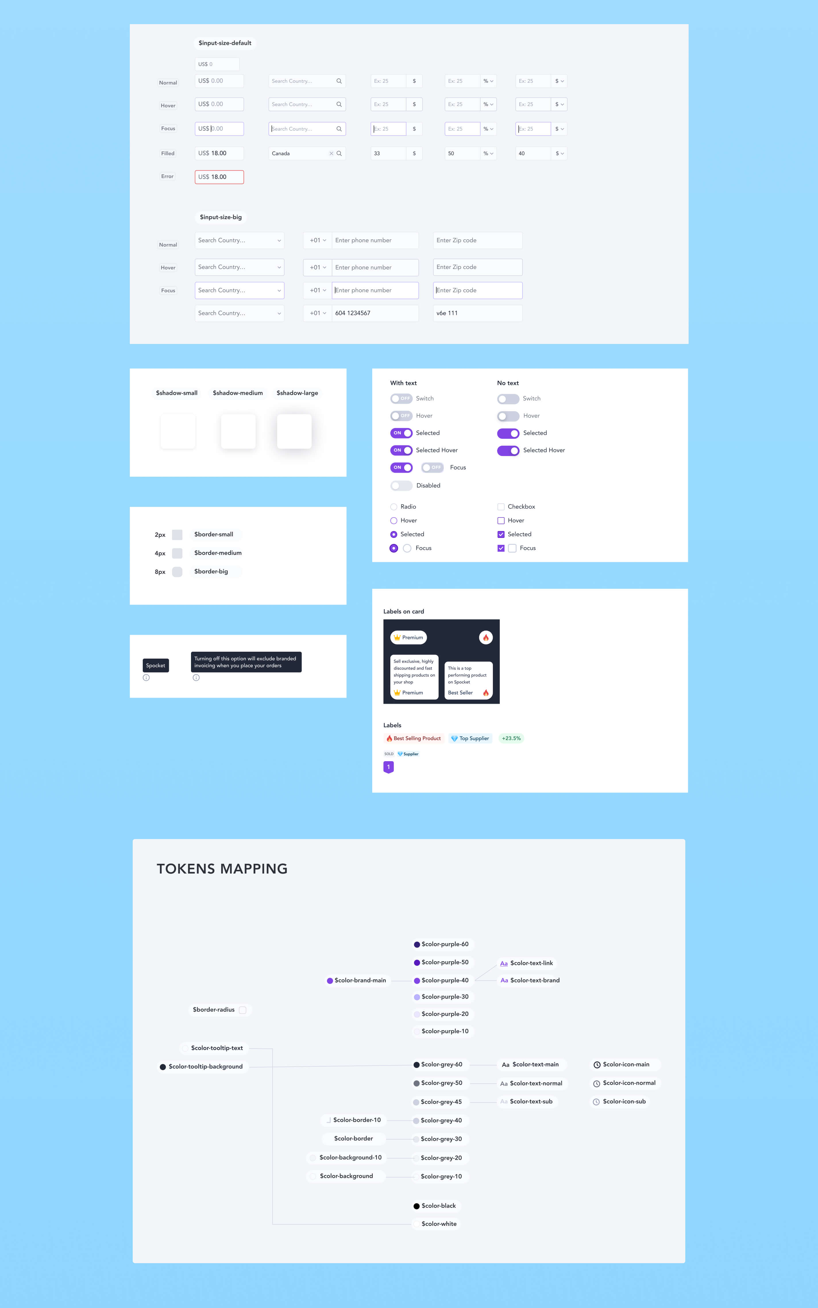
Design debt is also another issue, as the product doesn’t have a design system in place--while many design and UX inconsistencies need to be fixed.

Spocket old App layout
Current Spocket homepage at the beginning of the project

Improve the app experience for two types of user personas

The app has two different types of personas, identified as “New User” and “Expert User.” Each of them has different needs, so the biggest challenge was to create new app structure and layout that can accommodate both users.

Another challenge is to create a better, more flexible, and scalable UX/UI layout foundation that will allow the future capability to add more features.

  • Increase the percentage of users using categories
  • Increase the percentage of users visiting top converting categories
  • Reduce the number of users that over filter and experience zero search result issues
  • Increase the chances of users recovering from a poor experience with search results
  • Increase the likelihood of users not bouncing on page load
  • Increase the chances of users finding products they want to use
  • Create a new Design System and a layout capable to handle new features in the upcoming months

Double diamond design framwork

Double Diamond design process

Discover

This phase helped us define project milestones, conduct a competitive analysis, and consolidate the final product vision. The first step was to understand the current state of the app and how users interacted with it. To achieve that, we conducted a mix of qualitative and quantitative research.

We have collected all the user feedback we received from Shipright and the Customer Success team, categorized them based on their themes, and prioritized them accordingly. Additionally, we conducted a survey to understand how our users want to use filters and categories in the app. Moreover, the product team has also conducted a series of interviews with current users to gather their valuable insights.

Gathering user feedback

Dig into the data from top-performing categories by the number of products viewed, imported, and bought.

Analyzing data

I analyzed users' behaviour flows, clicks, and viewed users browsing video recordings and heat maps. This analysis showed valuable insights into which areas received the most user attention and engagement.
These findings were instrumental in identifying potential optimization opportunities for the homepage. I also conducted a design UX critique about the current app layout by highlighting major issues and flaws, then ranked them by the most critical ones.

People don’t really want filters, they want a more extensive list that helps them make difficult decisions.
UX review

To better understand the competition, I conducted a comprehensive analysis of Spocket's main competitors. This analysis involved reviewing their website's global navigation, homepage content and hierarchy, and how they structured their categories. By examining the competition, I could identify the most effective practices in the industry, as well as opportunities for improvement.

Competitive Analysis

After an extended analysis, we had a clear idea about the type of users that were using the product daily. We identified two of them:

  • New users - using the app for the first time.
  • Power users - successful drop shippers recurring daily on the app.

The final project outcome had to accommodate both.

UX user personaFirst user personaSecond user personaDesign process

Define

At the end of the discovery phase and before jumping directly to the solution phase, I wanted to involve the team members in creating principles to follow closely for the new design.

User browsing behaviour

I created user journeys for both personas to highlight how the experience differs based on their needs.

User journey 1User journey 2

Here are the final principles:

  • Our approach should be based on helping users get more relevant results, and make decisions between trade offs
  • A less cluttered search area is better
  • New and unsure users are better directed to a category than a search
  • We should push users towards categories where our inventory and conversions are higher
  • Showing supplier locations is a strategic advantage
  • We don't want most of our users to over filter (while we have less products), so any advanced filtering should probably be expandable or not immediately visible
  • When users show an interest in an area, we should encourage them to continue on instead of going back to the beginning and starting again
  • Category landing pages should be clear, helpful, and encouraging
  • Having locked filters can encourage sign ups
  • Giving users an indication of category popularity may make choosing one easier for them, and filtering should be based on contextual information
  • Pricing, margins, and shipping costs are key considerations for merchants
Principles

At this moment I revisited, and decided to update the categories structure as the old hierarchy wasn’t very logical at times. We identified that some sub-categories could be moved to the top of the structure, and we also kept the most successful categories in mind with the goal to have them at the top of the structure. During this process, I was collaborating with back-end engineers too to see how easy as to update the architecture.

Filter and categories

Design

After conducting research, I utilized the gathered insights to develop initial flows and low-fidelity mock-ups for desktop designs. These mock-ups incorporated all the principles mentioned earlier and included flows from the homepage to different categories. During this exploration phase, I utilized various approaches for visual UX and content information. After presenting my designs to the product team, I incorporated their feedback and we voted on the best screen approaches. Finally, I presented the mock-ups to project stakeholders for review and approval.

Design Lo-Fi

Below another round of iterations followed by team reviews on Miro.

Design Lo-Fi

After collaborating with the team for several rounds of iteration, we agreed upon the best flow, and I began creating high-fidelity mock-ups.

Design Hi-Fi

Top Header

One turning point to heavily feature the most important categories at the top of the homepage

Header Design before/after

Here's the final update on the homepage top bar and top categories. This layout was designed to cater to the needs of both new users and power users. As part of the homepage revamp, we also improved the "Quick filters" feature, which was loved by our users. We decided to display the most important search criteria upfront to make it more convenient for our users.

Quick filters before/after
Top Homepage
Category page
Subcategory page

Filters

We have added a new feature called "filters modal" that provides a powerful way to refine searches. We aimed to display the most important filtering criteria that would give a good number of search results. We have also labelled the most popular filtering options as "Pro" to highlight their effectiveness and encourage users to upgrade to the Pro Plan.

Filters

Text search bar

We analyzed the last major feature of our product which is the search bar. It is a commonly used method for users to narrow down their search and find the desired items. Our team aimed to build a smart and contextual search bar, but due to its complexity, we have moved this idea to the next release. For the first version, I laid the foundation of what we had in mind and developed a simple version of it. 
In version one, we have decided to provide two main search cases:

  • The generic search from the Homepage
  • Specific search when inside a category/subcategory

Generic search from Homepage

In this case user can type anything and the app will show all the related items as a result

Homepage search

Generic search from Category page

When a user searches for an item within a category, the app will look for the item name that belongs to that specific category. If the search results in few items or the user is not satisfied with the results, there is an easy option to remove the specific category and conduct a broader search that will show more items to the user.

Category search

Now we run the final review with the whole team, the layout got approved💥 Everyone was excited to bring the design to live!

Filter and Categories search
Star icon

The Product
Bringing it all to Life

Homepage - Video recording

Homepage new layout
New layout before/after

Category page

Filter- categories browse category

Sub-Category page

Filter categories browse sub category

Filter modal

Filter categories browse filter modal

Search result page

Filter categories search result page

Design system

I was assigned the responsibility of creating and enhancing the Spocket Design System. To accomplish this, I went through all the current application components, reorganized them, improved their quality, and designed new ones that were in line with the new homepage and category pages. During the development of the new Design System, I collaborated closely with front-end engineers, and we regularly checked on the progress of the new UI elements and how to reorganize them.

Design system overviewDesign system overviewDesign system overview
Design Process

Deliver

Prototype / Usability testing

We tested the flows internally with the team, we decided to don’t make usability testing with external people, as part of Spocket culture, we prefer release the feature to the public and carefully track all the metrics gathered by then.

Interactive Prototype

Implementation

Before proceeding with the implementation, I conducted meetings with the customer success team and the copy team to align on the content to be showcased on the homepage during the launch phase. Following these discussions, I focused on developing the necessary creative assets for the page. I also assisted the front-end dev team over some QA sessions.

Split deliverables

Due to the big project scope and with the goal of delivering the features on time, we decided to decrease the scope of the filtering modal. The final solution was to move some advanced features that required heavy back-end work to Phase Two. My work was to update the filter modal by showing the features agreed upon for Phase One and be mindful of the value provided to the user when releasing them with the Phase Two filters missing.

Deliverables

Next steps

  • Initiate a heatmap analysis using Hotjar to assess the click rate, the items added to the store and the bouncing rate for new users. Simultaneously, keep one eye on Hotjar video recordings to see how users are interfacing with the new layout.
  • To further optimize the homepage, conduct A/B testing. Experiment with small different content variations and content hierarchy to evaluate their impact on user engagement and conversion rates.

Insights

An interesting discovery from the first release was the heavy use of the top search bar, having such a big search box input increased the engagement about text searches. This insight gave us confidence about the planned next step of building a smart contextual search bar for the next phase!